Overwatch Hero UI Concept
Heroes are core to the Overwatch experience. What if the UI/UX helped further connect the player to the heroes they love? This Season 17 concept gives the game and Heroes an overhauled experience.

Table of Contents
About the Project
At its core, Overwatch 2 has a strong gameplay experience because of its Heroes. The diverse play-styles, backgrounds, and personalities guarantee players can find something they connect with. The closer players feel to the Heroes they play, the more likely they are to come back and play again.
The Overwatch 2 Progression system was introduced in Season 6 (August 2023). The system was introduced as a way to reward players for spending time with their favorite heroes, increasing the Player - Hero connection. However, for long time players the system did not achieve this goal, as it was simple and non-customizable. For new players, confusing and hidden within layers of menus. Since then, the system has not received a major update.

Goals and Challenges
Goal 1: Make Hero Systems more engaging, intuitive, and rewarding.
Goal 2: Create a stronger Player-Hero Connection with player expression.
Goal 3: Simplify Navigation between core game menus, and create a centralized hub for Hero information.
This project was quite ambitious from the start, and it was challenging to develop so many improvements to current features as well as entirely new systems. Because of the wide scope, I didn't have time to create a screen for everything, but I was able to create the core ideas that could be expanded upon in the future.
Process
For this project, I followed a detailed UI/UX approach to manage the complexity of the challenge. This involved a 9 Step process beginning with a Player Journey to observe player behavior, followed by an extensive design phase and concluding by checking Accessibility standards.

Player Journey
I followed a Player Journey using the Hero Progression systems, including viewing and finding statistics, understanding how Progression works, and more.

My main findings from this Player Journey were fascinating:
- In order to find Hero Progression, the player (Gillian) went to Heroes > Hero > Progression instead of the Career Profile
- Gillian found it confusing that Progression's UI looked different
- It took 4 steps to locate stats about the Hero such as All-Time Eliminations
- Gillian did not understand the Perks system and each Perk did without going to the Training Range
From this Journey, I identified the following opportunities:
- Improving the overall Game Navigation
- Making the Hero Experience more engaging and informative
- Make Perks easier to understand
- Update the Progression system to be more intuitive and expressive.
Paper Prototype & Flowchart
After conducting the User Journey, I created Paper Prototypes and a Flowchart in FigJam in order to organize information, and then map them to screens. For the Flowchart, I created groups to represent a nested tab structure, since the Progression screen would have its own set of tabs.


Wireframes
Using the Flowchart, I designed wireframes for the new game systems. To view the interactive prototype, Fullscreen the Figma Prototype below and click between screens.
User Study Feedback
I conduced a user study with Figma's Prototype feature, and discovered that at large, the new changes were very well received. The main feedback was that the History Tab (then called Game Reports) was too similar to the Game History tab, so it was changed for the final version. Also, the Abilities preview was confused for a static image, which is difficult for a prototype to replicate, but I added a Play button to make this more clear.
UI Art + Styleguide
For this project, I wanted to stick within the current Visual Identity of the Overwatch game because it is so well established. The new UI Art I created used a design language consistent with the current UI Library.


Final UI
Game Navigation
To address the first goal, at the top of each screen (not the main menu) I added a Global Navigation UI. This allows players to always have the Core Game screens shown at all times: Play, Home, Heroes, Battle Pass, Events, Challenges, and Shop. This makes systems easily accessible while not sacrificing much of the screen.

Hero - Overview
In order to improve the Hero Experience, I added a new Tab Interface to each Hero Screen, allowing for more overall information, separated by interest for quick navigation. This includes new screens for Overview, Progression, Abilities, History and Lore, with Cosmetics remaining largely the same.
.jpeg)
The Overview Screen has quick information about the Hero, giving a better idea of that Hero's identity and basic story at a glance. The background now also displays a location relevant to the Hero's story. For example, Tracer's background is Kings Row, but for Winston it would show Watchpoint: Gibraltar instead.
Players could also display Custom Backgrounds that they could unlock with Shop Skins, adding an additional Cosmetic that could be added to Bundles.
.jpeg)
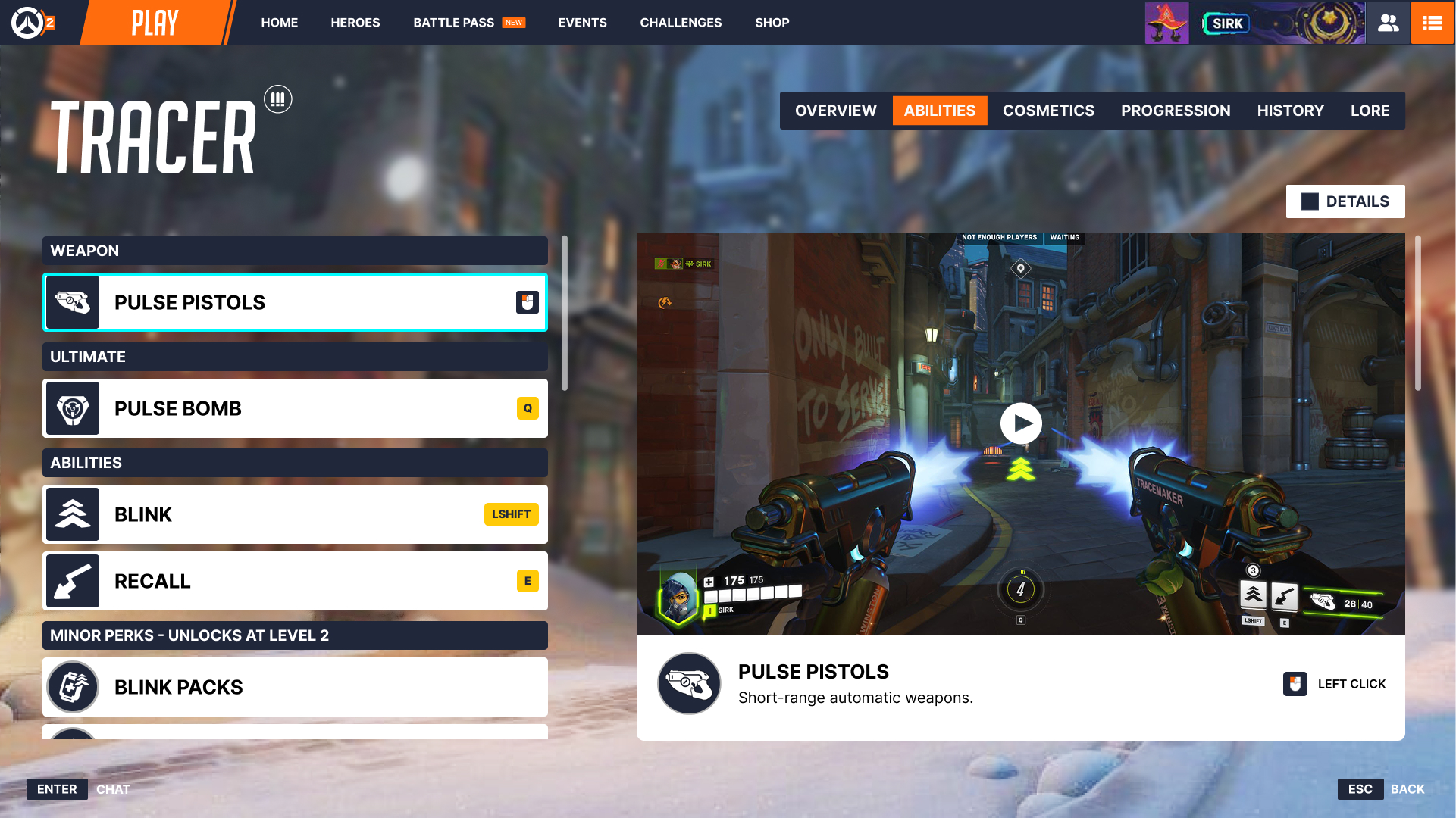
Hero - Abilities
The new Abilities Screen shows Abilities, Passives, and Perks in a visual format by playing a video of each. This has the benefit of being able to understand a Hero's capabilities before getting in a game and improves the learning curve with learning by example. It also displays the Key Bindings which is great for Accessibility.
Competitive Overwatch players have been asking for a while for a way to view specific information about Abilities instead of vauge descriptions, so i've also added an option to expand to show detailed stats like Damage Per Second or Falloff Range.


Hero - Cosmetics

Hero - Progression
The Progression system has received a big update. It is now integrated into the Hero screen, and has 4 main Tabs: Statistics, Hero Level, Challenges, and Leaderboard. Having Progression in the Hero UI removes disruptive UI changes of switching from Hero to Career Profile, and simplifies the task of finding information about your Hero.

Statistics
The Statistics Tab combines the current Statistics and Progression numbers found in the Career Profile into one experience. Because the Statistics and Progression screens show overlapping data already, this simplifies the experience.

The Statistic Cards now show the total number instead of the Level (this can be changed via the Total Filter Dropdown) and every statistic now has a Badge. The stats can be shown in List View or Grid View.
Players can now also Favorite up to 3 Badges to highlight on their Showcase Card. To make these more expressive, new Badges have been added. For example, Hero-specific Eliminations, so you can show off how many Mercy players you've sent back to the spawn room. Or on a support Hero like Ana, you could show Sombras Slept.
.jpeg)
.jpeg)
Hero Level
The Hero Level Tab shows your current Hero Progression in a UI inspired by the Battle Pass, gamifying the experience. This also adds the capability of seeing which Badges you are close to earning as well as which level they are earned, which was not possible before. You can also see the Rewards, instead of going to Challenges > Hero > Select Hero > Progression and scrolling down a long out-of-order list.

Challenges
The Challenges Tab shows new Hero Challenges that can be completed in order to earn Hero EXP. For example, if Tracer players stick 30 pulse bombs to Enemies, they earn 6000 EXP towards their Hero Progression. This incentivizes play and helps players level up in a more interesting way.

Leaderboard
The Leaderboard Tab appeals to the competitive Player, allowing them to compare their Hero's progress, competitive ranking, hero mastery and more to their friends or region.

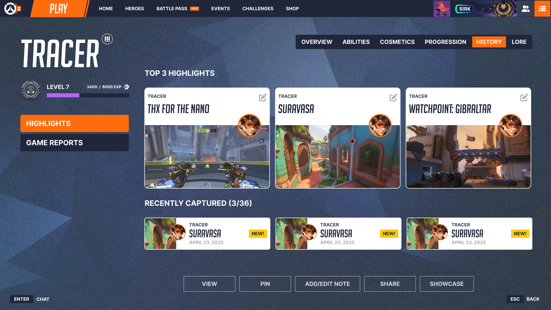
Hero - History
It can be difficult to find previous games you played on a specific Hero through the History tab in the Career Profile since there are no sorting options. The new Hero History tab shows previous games where you had more than 5 minutes of playtime on that Hero. You can see Hero-specific Highlights, Replays and Game Reports.

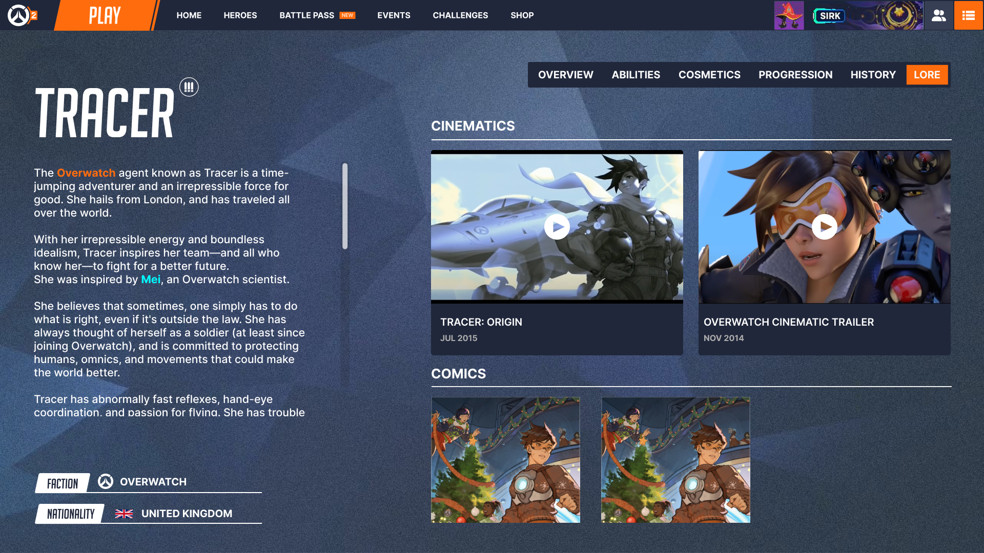
Hero - Lore
The Lore Screen hosts a long story of each Hero, as well other forms of media, including Comics, Cinematics, Stories, Notes, and more. This helps players find out more about a Hero they aren't familiar with incorporating the great external media in the Overwatch universe.

Accessibility
After creating the UI screens, I ran them through an Accessibility Checker to ensure that the new system could be properly interacted with for users with vision impairments.


Prototype
I created a Figma Prototype from the UI Art to allow Players to interact with the screens as if it was a working game. I ran a simple Player Test with a player "Will" where they completed 22 tasks in the live Overwatch 2 game across various game systems including the Hero screens, Progression, Navigating Game Menus, and finding Statistics.
I then asked them to perform the same tasks in the Figma Prototype to compare satisfaction, understanding, and time to complete for each task.
You can view the Prototype for yourself here:
Outcomes
The results from the Player study were very positive.
- Efficiency: 7 Actions to complete Menu navigation (Prototype) vs. 14 (Live Game) - a 50% reduction in actions needed.
- Accuracy: 1 Missed Action (Prototype) vs. 5 Missed Actions (Live Game) - an 80% reduction in incorrect choices.
- Comfort: Comfort of entering a Game on a New Hero increased from 5/10 to 8/10 with new Ability Preview videos
- Satisfaction: Overall rating of ease for completing tasks increased from 6/10 to 9/10
This project was a ton of fun to work on, and I learned a lot about UI / UX design, especially while working in established design systems.
Given the scope, I'm happy with how much I was able to design and improve upon in a short time. Given I am a regular Overwatch player, it was likely easier for me to identify issues and propose solutions than a game I am less familiar with, and I would like to work on a game I have less experience with.
.jpg)
.jpg)
.jpg)